How to Activate the Advanced Visualization Chart
Learn how to launch the in-page Advanced Visualization chart to annotate, customize, and analyze your Google Search Console performance data.
The standard Google Search Console performance chart provides a basic overview of your metrics, but it lacks the tools needed for deep, customizable analysis. The Advanced GSC Visualizer solves this by injecting a fully featured charting tool directly on top of your existing GSC interface.
This guide is the first in a series and covers how to launch the tool and a summary of what you can do with it.
Step 1: Navigate to the Performance Report
Open Google Search Console and navigate to the standard Search results (Performance) report from the left-hand menu.
Step 2: Verify Prerequisites
Before launching the advanced chart, you must ensure your current GSC view meets two requirements:
- Timeframe: Ensure the date grouping is set to Daily.
- No Compare Mode: Ensure you are not currently running a date comparison in the standard GSC filters.
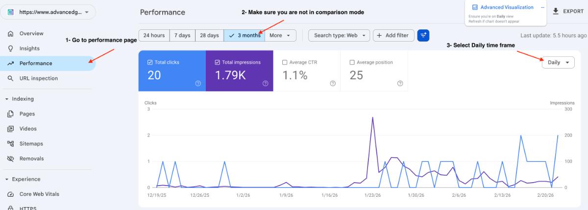
Step 3: Launch the Visualizer
Look for the floating button labeled Advanced Visualization on your screen.
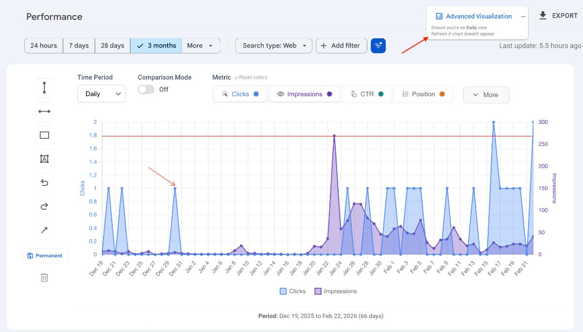
Click this button. The extension will take a brief moment to extract the data from your existing GSC tables.
Once loaded, the new, interactive Advanced Visualization chart will appear directly on top of the standard GSC chart.
Feature Summary: What Can You Do?
This new charting interface acts as a complete analytics workspace. Here is a summary of the features you now have access to:
1. Annotations & Drawing
- Draw custom lines, boxes, and arrows directly onto the chart to highlight specific traffic spikes or drops.
- Toggle official Google Updates to see how algorithm changes impacted your traffic.
- Import or export your custom annotations for team reporting.
2. Timeframes & Comparisons
- Instantly switch your data view between Daily, Weekly, or Monthly timeframes without reloading the page.
- Split your selected date range into two distinct periods and compare them directly on the chart.
3. Customization & Analytics
- Change the chart type to match your preference (Line chart, Bar chart, or Area chart).
- Apply Trendlines or Moving Averages to smooth out daily volatility and identify true traffic direction.
- Customize the chart colors to match your brand or client reporting guidelines.
4. Data Export
- Export the visualized data directly from the new chart interface for external use.
Next Steps
Now that you have the chart activated, give the features a try! Read the rest of the articles in this series for detailed, step-by-step instructions on how to use each specific visualization tool.