How to Annotate and Draw on Google Search Console Charts
Learn how to draw lines, rectangles, and text annotations directly on your GSC performance charts to highlight SEO trends and updates.
Analyzing SEO performance often requires marking specific dates for algorithm updates, site migrations, or traffic thresholds. The Advanced GSC Visualizer provides a built-in annotation toolkit that lets you draw directly on your performance data.
This guide explains how to use the drawing tools once you have activated the advanced chart.
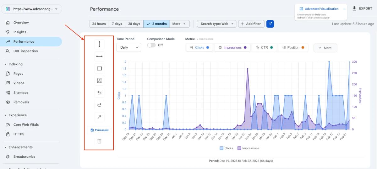
Step 1: Locate the Annotation Toolbar
Once the Advanced Visualization chart is active, look to the left side of the chart interface. You will see a vertical toolbar containing icons for various drawing tools, including lines, rectangles, text, arrows, and undo/redo functions.
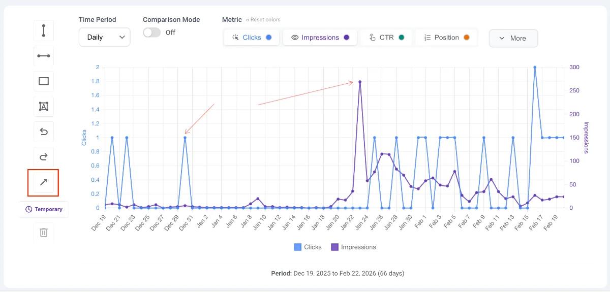
Step 2: Choose Your Save Mode (Permanent vs. Temporary)
Before drawing, decide if you want to keep your annotations for future sessions or if you are just doing a quick, temporary analysis.
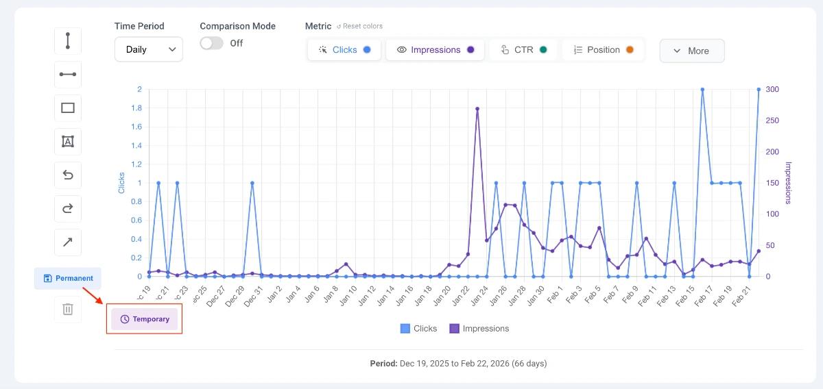
- Permanent Mode (Save Icon): This is the default state. Whatever you draw will be saved automatically to your Chrome local storage. The next time you open the visualizer for this specific GSC property, your drawings will reappear. Note: Annotations are saved per property, so they will not overlap onto your other websites.
- Temporary Mode (Clock Icon): Click the save button to toggle to temporary mode. The button will turn light purple and display a clock icon. Any annotations made in this mode will disappear when you close or refresh the chart.
Step 3: Using the Drawing Tools
Select your desired tool from the left menu to start annotating the chart.
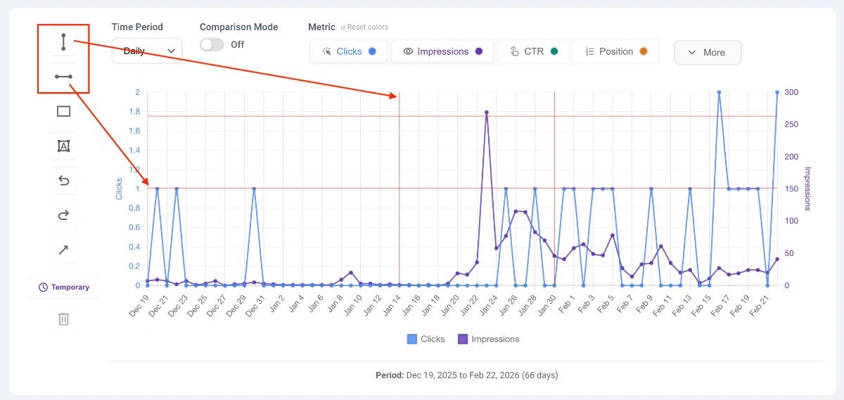
Horizontal & Vertical Lines
- How to use: Click the line icon, then click anywhere on the chart to place it.
- SEO Use Case: Use vertical lines to flag a specific date (e.g., a Google Core Update or a major site deployment). Use horizontal lines to set performance benchmarks or thresholds.
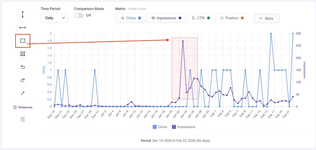
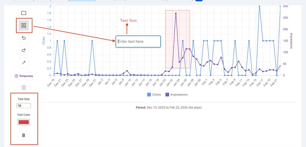
Rectangles
- How to use: Click the rectangle icon, then click and drag your mouse across the chart to define the shape.
- SEO Use Case: Highlight a specific date range, such as a holiday season or a period of server downtime, to visually isolate that performance data.
Arrows
- How to use: Click the arrow icon, click your starting point, and drag to draw the arrow.
- SEO Use Case: Point directly to sudden traffic spikes, drops, or specific data points you want to draw attention to.
Text Labels
- How to use: Click the text icon. When selected, three new formatting options will appear: Text Size, Text Color, and Boldness. Customize your text, then click on the chart to type your note.
- SEO Use Case: Add context to your lines and arrows (e.g., writing "March Core Update" next to a vertical line).
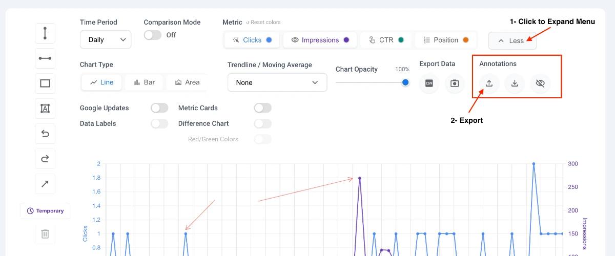
Step 4: Managing and Sharing Annotations
Once your chart is annotated, you can manage your drawings or share them with colleagues for collaborative reporting.
Navigate to the More button in the tool menu and look for the Annotations section.
- Export & Import: Use these buttons to download your current annotations as a file, which you can send to your team. They can use the import button to load your exact drawings onto their own GSC view.
- Visibility Toggle (Eye Icon): Click the eye icon to instantly hide all of your permanent drawings. This is useful if you want to temporarily view a clean chart or make temporary drawings without deleting your saved work.
Step 5: Modifying and Deleting Elements
If you need to adjust or remove an annotation after you have drawn it:
- Select and Move: Click on any drawn element to select it. The selected element will be highlighted in blue. Once selected, you can click and drag the element to move it to a new position on the chart.
- Delete: With the element selected (highlighted in blue), click on the trash icon in the toolbar to delete it completely.