How to Compare Date Ranges and Create Difference Charts
Learn how to compare date ranges, view period-over-period metric cards, and generate Red/Green difference charts for SEO reporting.
Analyzing period-over-period data is essential for measuring SEO progress. The Advanced GSC Visualizer enhances the standard Google Search Console comparison view by introducing dedicated metric cards, clear visual delineations, and specialized difference charts.
Follow these steps to activate comparison mode and customize your reporting visualizations.
Step 1: Activate Comparison Mode
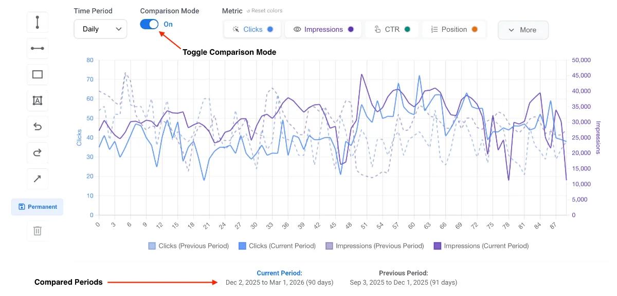
Ensure you have the Advanced Visualization chart active on your screen. Locate the Comparison Mode toggle in the tool menu and turn it on.
Activating this feature automatically splits your current date range into two equal, consecutive periods.
By default, the chart displays both periods simultaneously:
- Current Period: Displayed as a solid line.
- Previous Period: Displayed as a dashed line.
Note: You can still use all standard charting features while in comparison mode. Feel free to change the timeframe (Daily, Weekly, Monthly) or adjust the chart type (Line, Bar, Area) to suit your analysis.
Step 2: Enable Metric Cards
To see the exact mathematical differences between your two periods, activate the Metric Cards feature from the menu.
This generates four distinct summary cards directly above the chart for:
- Clicks
- Impressions
- CTR (Click-Through Rate)
- Position
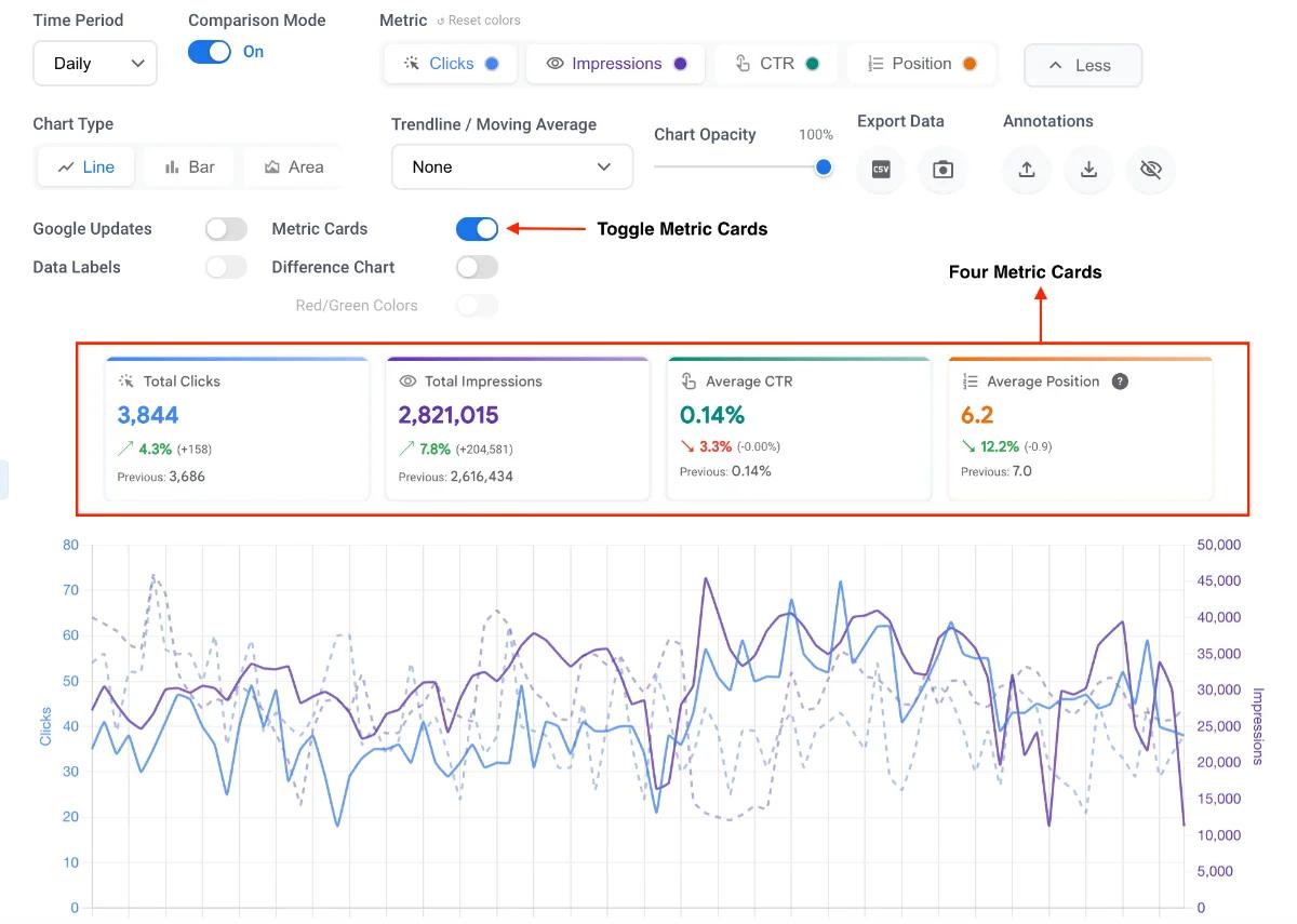
Each card displays the total numbers for both periods and the exact percentage change, allowing you to quickly assess overall performance shifts at a glance.
Step 3: Switch to the Difference Chart
If overlapping lines make it difficult to spot daily trends, you can change the view format. Click the toggle to activate the Difference Chart.
This transforms the graph from showing two separate timelines into a single chart that visualizes the exact delta (difference) between the periods.
- Positive values represent days where performance improved compared to the previous period.
- Negative values represent days where performance dropped.
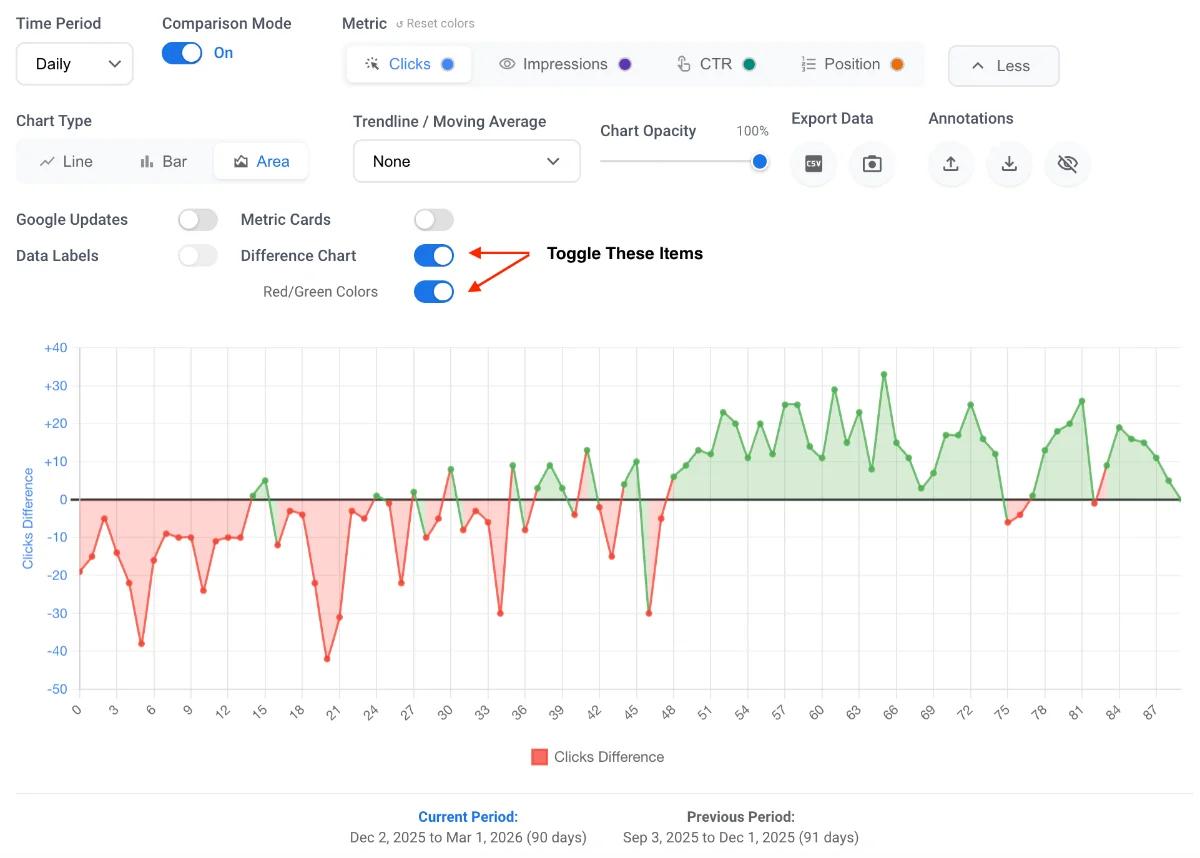
Step 4: Apply the Red/Green Toggle
To make the difference chart instantly readable, activate the Red/Green Toggle.
This applies conditional coloring to your chart elements:
- Green: Highlights "winning days" where metrics increased.
- Red: Highlights "losing days" where metrics declined.
Step 5: Export a Presentation-Ready Screenshot
Creating clear reports for stakeholders requires context. When you use the comparison features, the extension automatically formats the visualizer to be presentation-ready.
The tool explicitly prints both the "Compare from" and "Compare to" date ranges directly below the chart. This ensures that when you take a screenshot, the exact timeframes being compared are baked right into the image, giving you a high-quality, ready-to-share asset without requiring external image editing.